UX Case Study
Scaling automated outreach for enterprise recruiters
Overview
Grayscale offers significant value to high-volume recruiters by allowing them to automate outreach to frontline candidates at every stage of the hiring process.
As the sole designer, I redesigned Grayscale’s two flagship mass-messaging features, Automations and Bulk Messages, to target enterprise customers upmarket without compromising the experience for existing SMB recruiters.
Company
Grayscale, acquired by Paylocity in 2026
Role
Sole UX Designer
Timeline
8 months in 2025
Team
PM, engineers
Goal
Revamp automated feature UX for enterprise-readiness
1. Discovery
Personas
The upmarket push was ramping up and several new people were joining. Outside of design, nobody had a clear picture of who we were building for. I did a deep dive into our personas and presented a simple persona framework, which I will summarize below:
Recruiters
The primary user persona who uses Grayscale alongside their ATS to complete daily tasks related to their job. They value quick, repetitive task completion that sits cleanly in their software stack.
Admins
People who own and maintain the system for end users; often in close contact with support, and provide support to their own org. They value single-page configuration-heavy flows, prioritizing efficiency over beauty or explainability.
Candidates
Users who apply to jobs through AI Chat, WhatsApp, or SMS. They interact with whitelabeled interfaces and conversational flows, so they shouldn't feel like they are using our product at all. The goal is to keep them engaged in the task at hand long enough to submit an application to our customers.
The response surprised me. A few people told me they hadn't known design was thinking about this at all, and that it made them more confident in the decisions we were making.
Discovery Findings
We knew of existing customer pain points and product gaps blocking enterprise-readiness, so I conducted research and a lightweight heuristics evaluation to understand which existing UX patterns to build on or rethink.
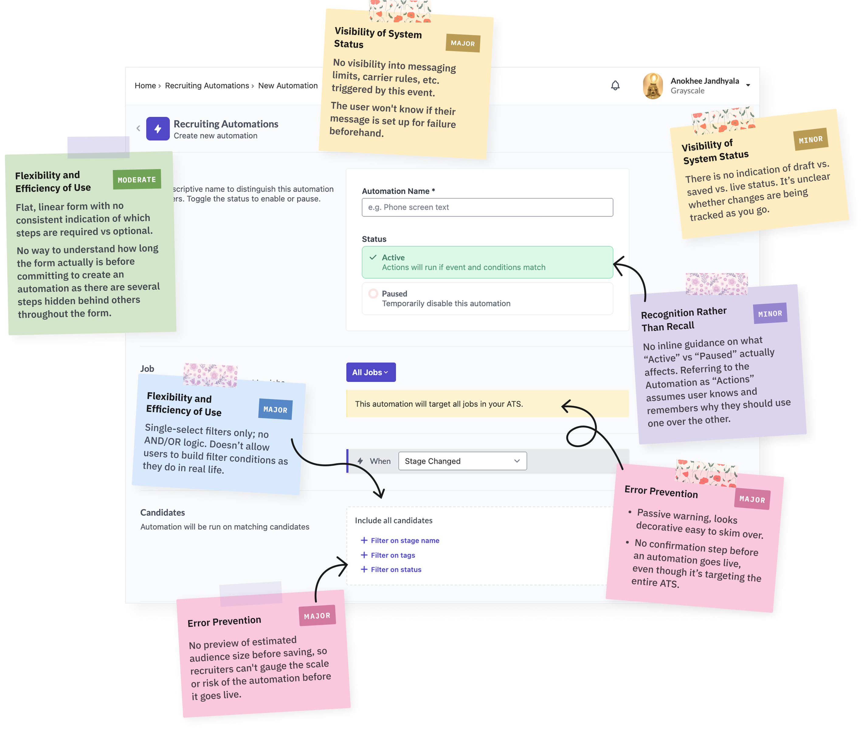
We heard from stakeholders that products demoing a beautiful, user-friendly experience for recruiters had a competitive edge, so modernizing our design language was one priority.
And, because we were scaling messaging for enterprises with multi-level user hierarchies, the scope of the redesign went beyond simply reskinning components to accommodate higher data volumes. We needed to understand the everyday use cases of a new set of user types, and reconstruct end-to-end flows accordingly.
Errors
With a small candidate pool, erroneous or failed messages can be addressed with a few calls or messages, but at scale, could deter many candidates from applying to the role as they might lose trust in the system or brand.
Audience targeting
Enterprise recruiters often hire for many similar roles across departments, locations, time zones, and, in some cases, subsidiaries. Targeting just one of those roles could require a dozen or more filter conditions compared to the single one that Grayscale allowed.
Organizational distance
At small companies, most recruiters have admin-level access to Grayscale's system. Enterprise organizations, by contrast, restrict admin rights more tightly, so when recruiters hit something they don't have permission to do, they have to go through many layers of support, which takes more time.
Training
With many recruiters across an enterprise organization, consistent training on every platform nuance isn't realistic. Without a clear understanding of rules like character limits, carrier restrictions, and outreach-window enforcement, users can send messages that fail without knowing why.
Design Process
I found the conclusions from discovery most useful once boiled down into a set of guiding principles. They became a checklist I could use to explain a design decision to stakeholders, or rubber-ducky with when working solo.
Help users catch errors before they hit send.
Previews, confirmations, and review steps needed to catch errors before they reached a wide audience without adding friction to routine messages.
Audience targeting needs to feel simple.
Filtering needed to support complex, layered criteria for enterprise use cases, while staying intuitive enough for smaller customers who didn't need that depth.
Make the system self-explanatory.
Platform and carrier rules, contextual microcopy, and the consequences of a selection needed to be visible in the moment so recruiters could send successful messages without relying on training or support.
Sketching at Low-Fidelity
This was a large undertaking with a lot of complex, interdependent sub-features to design from scratch. Some things, like settings and forms, could be taken directly to high-fidelity while others surfaced a lot of complexity at once and needed several rounds of iteration starting from low-fidelity.
Small Feature: Auto-Link Shortening
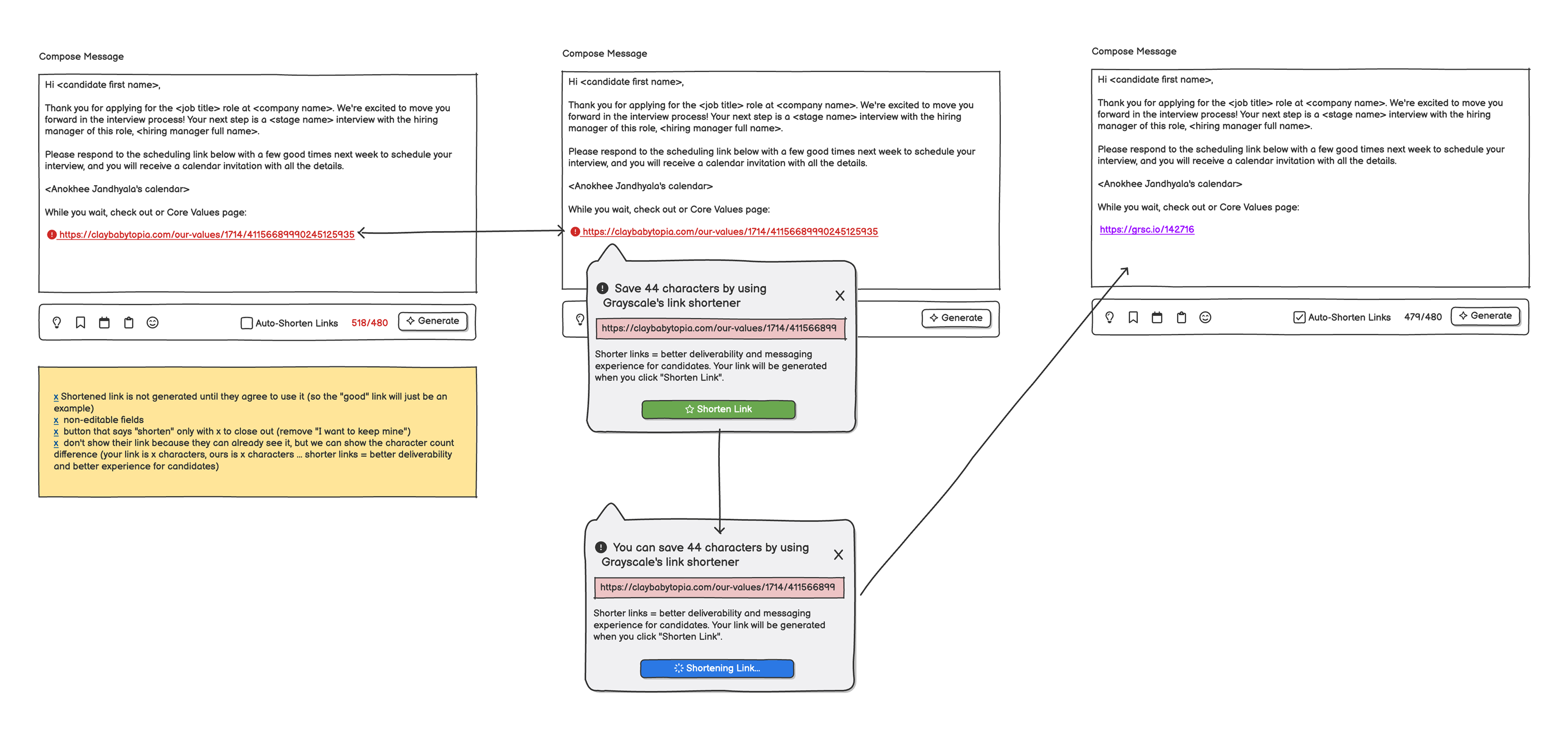
Long links push a text past the carrier's character limit, which splits it into two messages and breaks the link in half. I sketched a few approaches. The one product liked best shortened links automatically as the recruiter typed. It also needed more engineering than we had, so what shipped was a character count and a pre-send dialog telling the recruiter to shorten the link themselves.
Large Feature: Outbound Attachments
Inbound attachments only had to be displayed or blocked. Outbound meant we needed to surface failed uploads, oversized files, unsupported formats, and accommodate a different set of rules on SMS than on WhatsApp. I sketched every state before anything was built, which gave engineering something concrete to react to, and made it easy to cut the ones that weren't worth it, like a specialized UI I'd proposed for attaching links.
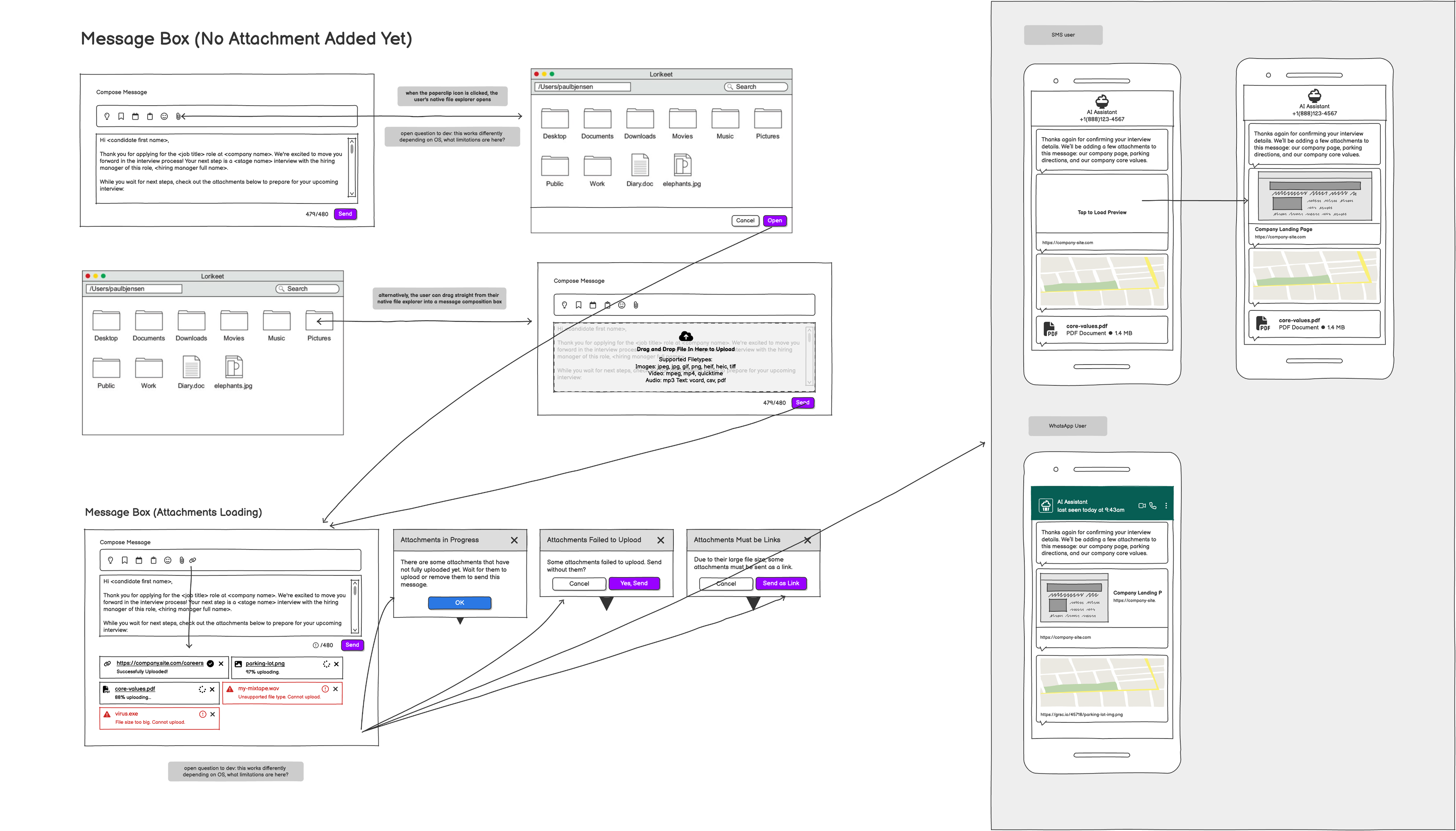
Outbound attachments explorations
Reflections on the Process
Throughout the design process, creating the UI components was the easiest part. The challenge was that enterprise recruiters experience higher turnover than those at smaller orgs and operate inside permission structures and platform rules that are not obvious and subject to changing.
Almost every design decision here was about surfacing an invisible constraint and informing a user when their message has failed or may fail without blocking their efficiency.
Final Designs
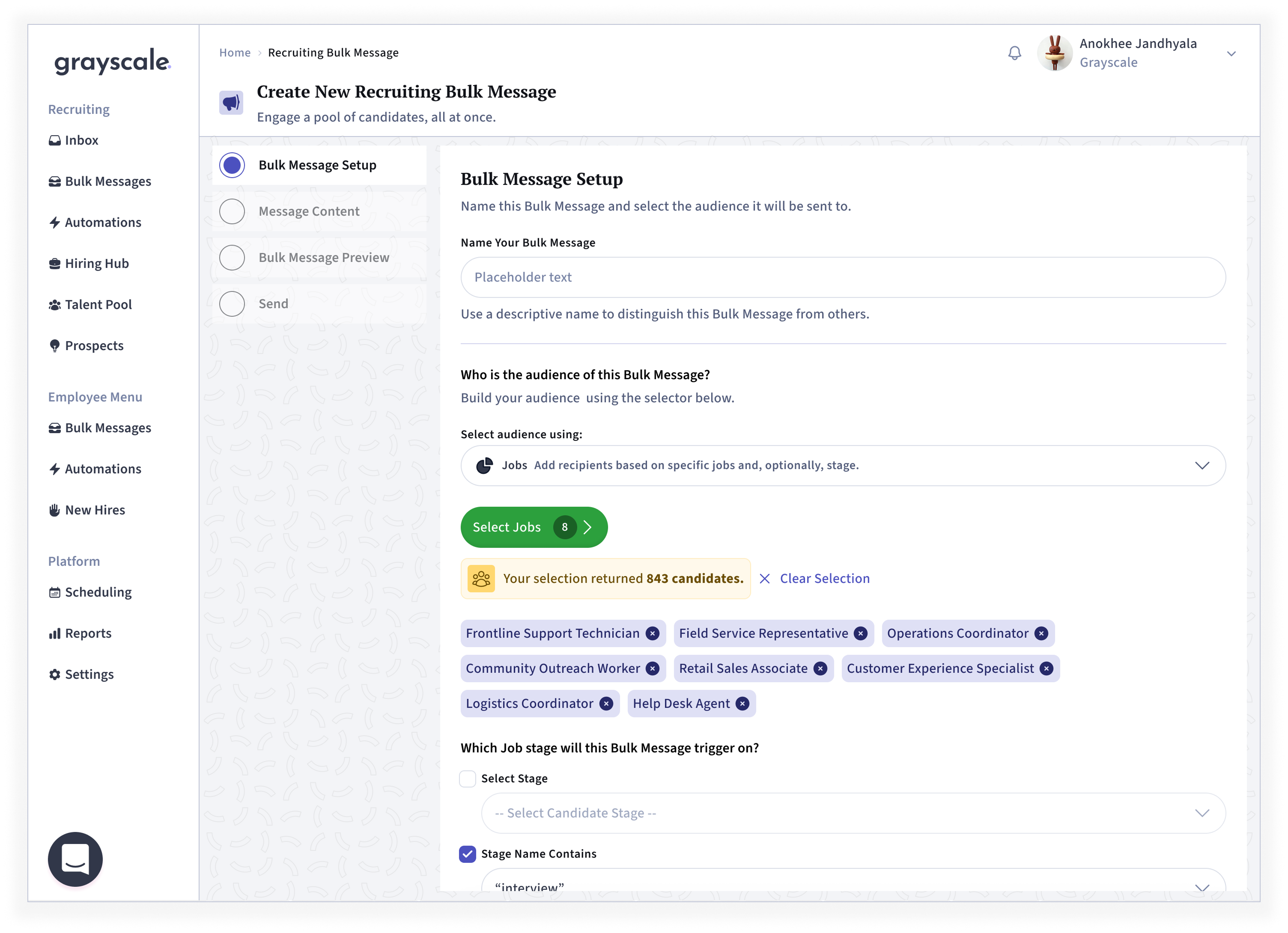
1. Audience selection with live candidate count
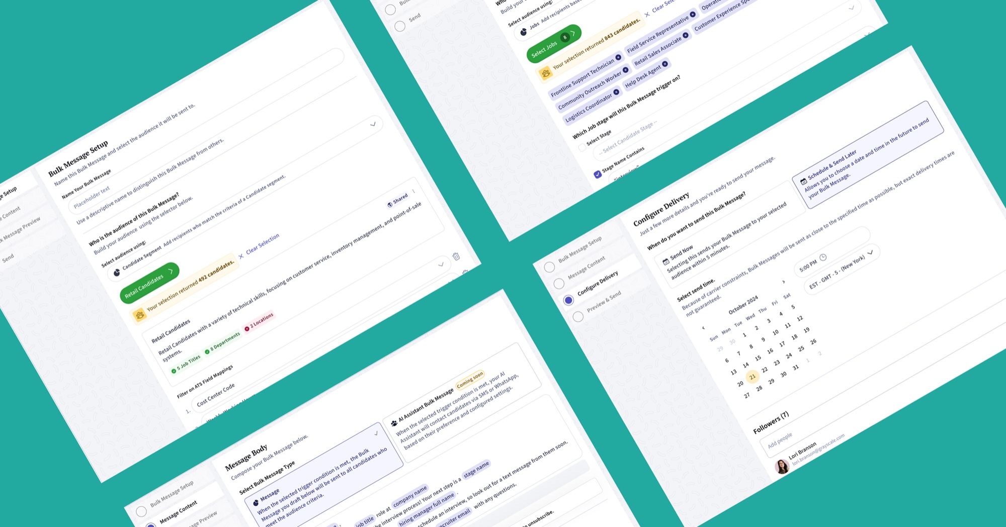
Recruiters can select multiple jobs at once and layer stage filters on top. The running total (843 candidates) confirms the audience before sending.
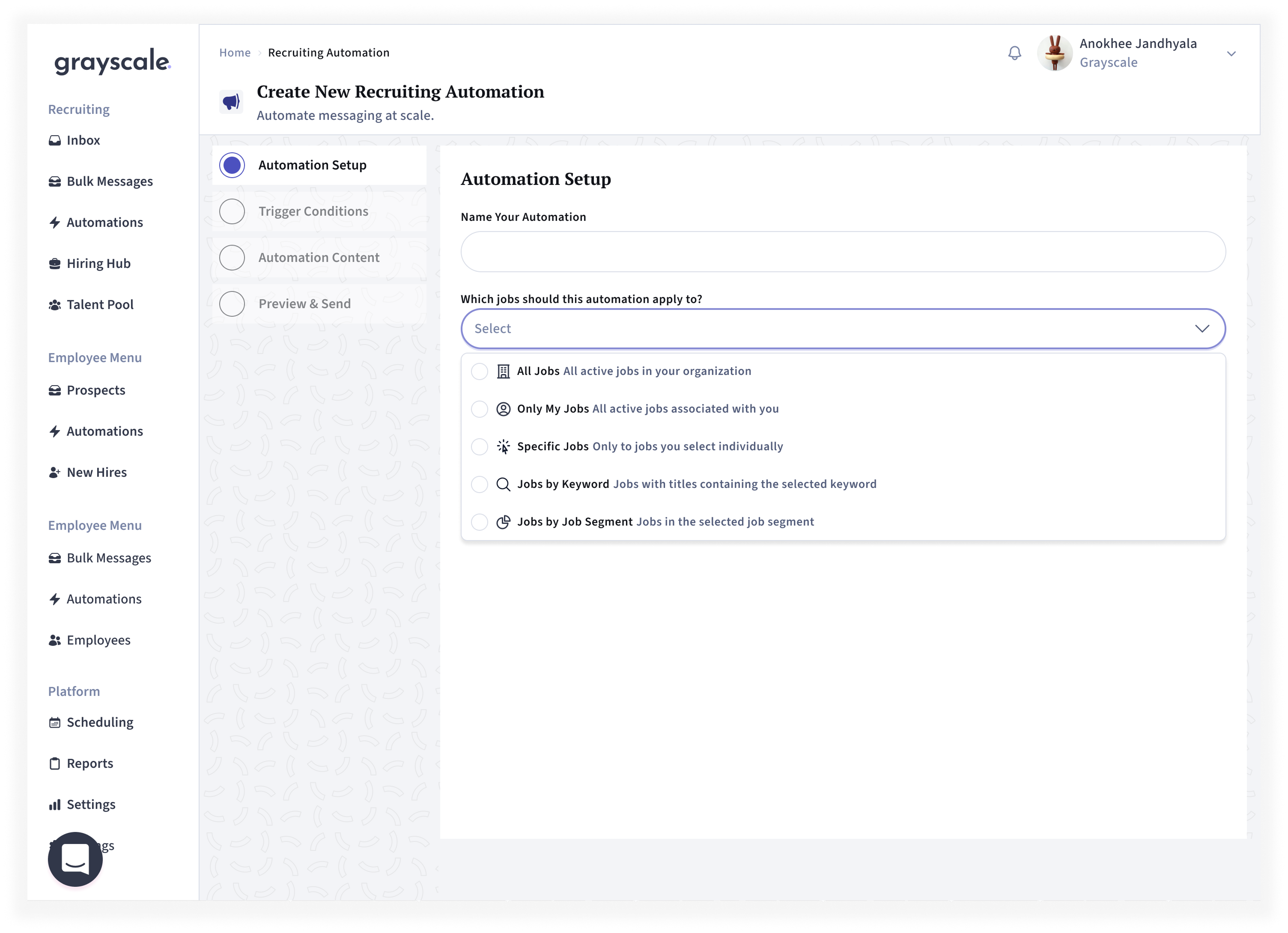
2. Job scoping for automations
Automations can apply to all jobs, only the recruiter's jobs, specific jobs, jobs matching a keyword, or a saved job segment. Each option carries a one-line description so recruiters can scope an automation correctly without training.
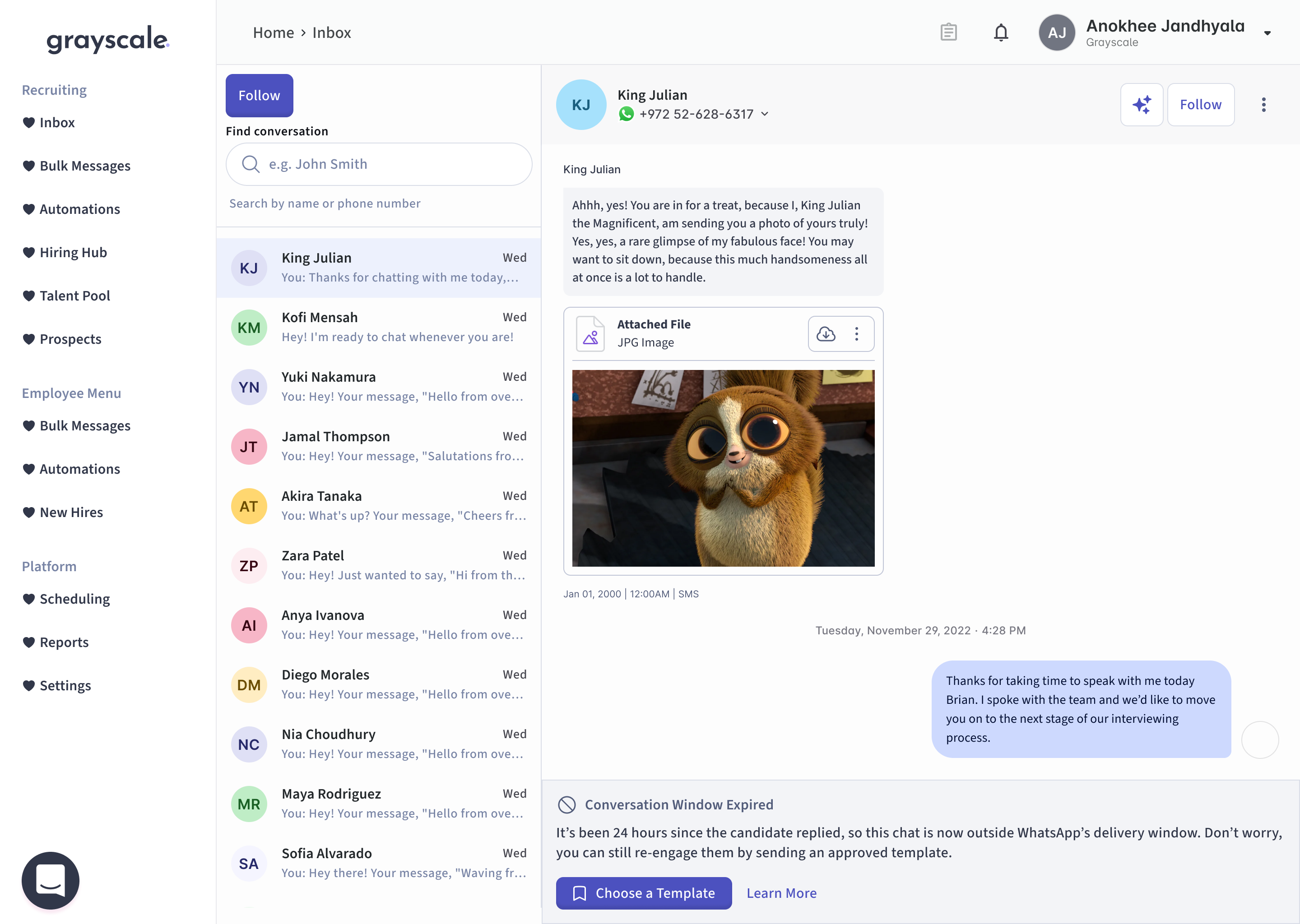
3. Contextual handling of the WhatsApp delivery window
When a candidate hasn't replied in 24 hours, the conversation falls outside WhatsApp's messaging window. Rather than silently disabling the input, the interface explains why and routes the recruiter to an approved template. We surface a platform rule at the moment it applies.
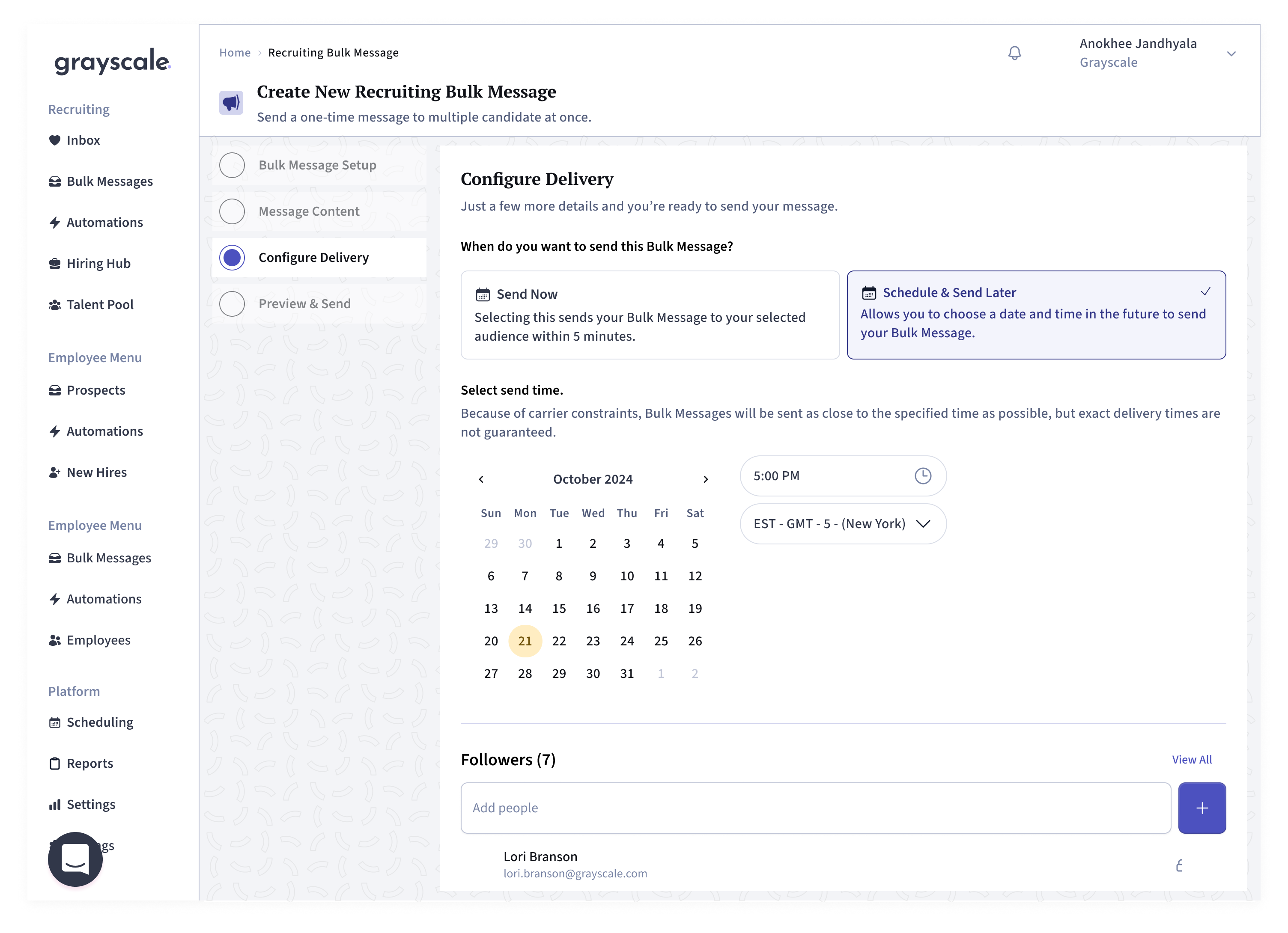
4. Delivery scheduling and send-time expectations
Recruiters can send immediately or schedule for a future date, time, and timezone. Inline microcopy explains up front that carrier constraints make exact delivery best-effort rather than guaranteed, setting accurate expectations in the moment.
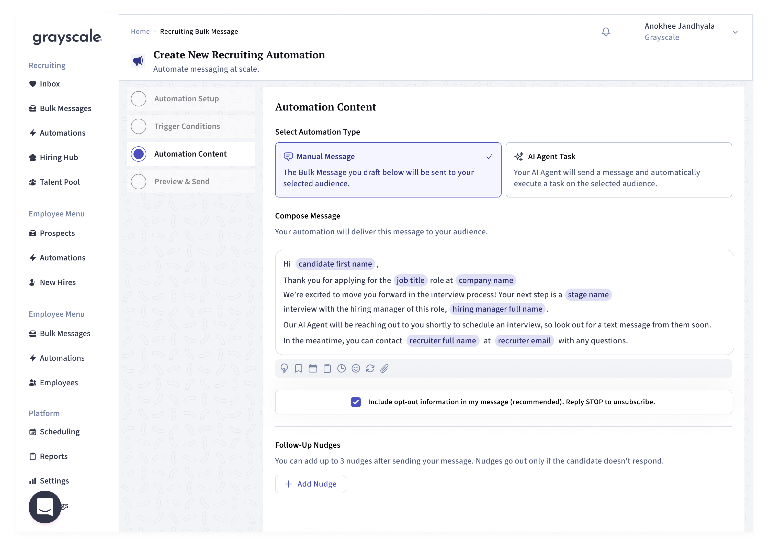
5. Message composition with merge fields and compliance guardrails
Recruiters compose a message with inline merge tokens that personalize each send at scale. Opt-out language is included by default and flagged as recommended, keeping messages compliant without relying on the recruiter to remember — an error-prevention guardrail surfaced in the moment, per discovery. Follow-up nudges can be layered on and fire only when a candidate doesn't respond.
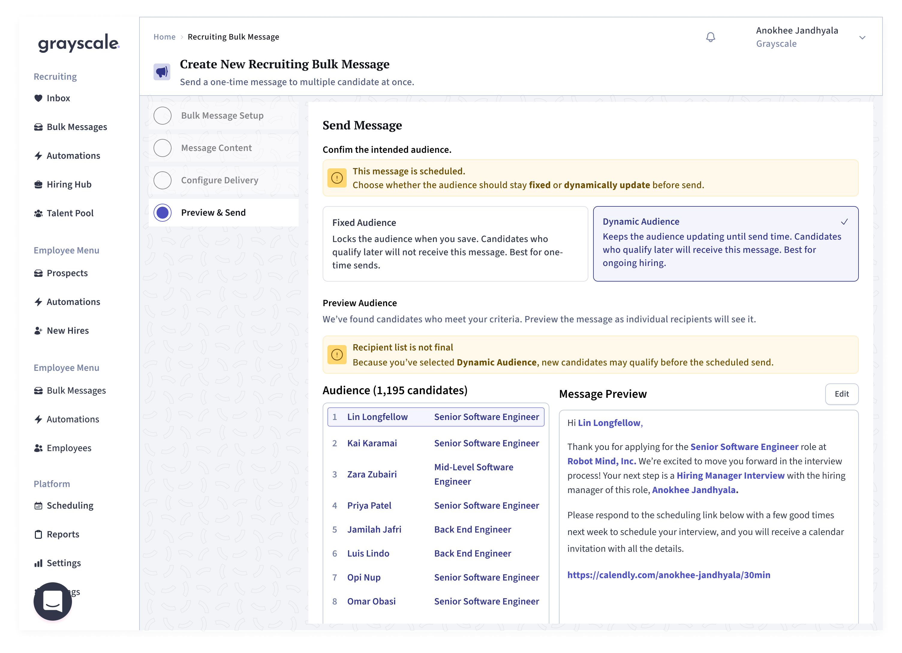
5. Preview and send confirmation
Before a message reaches 1,195 candidates, recruiters confirm the audience and see the message rendered exactly as an individual recipient will. They choose whether the audience stays fixed or updates dynamically until send, with a contextual warning when a dynamic list means recipients aren't final — catching errors before they reach a wide audience, per discovery.